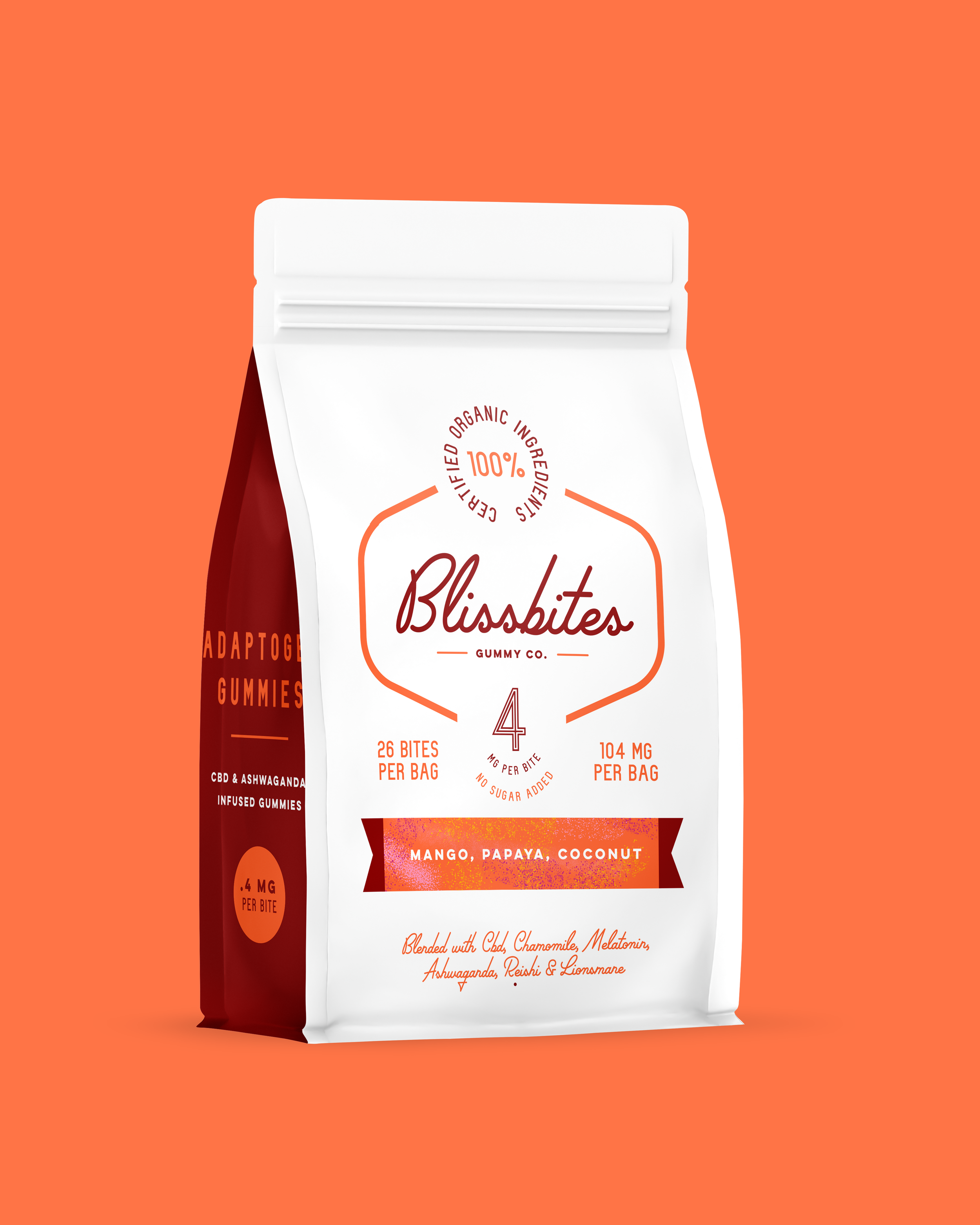
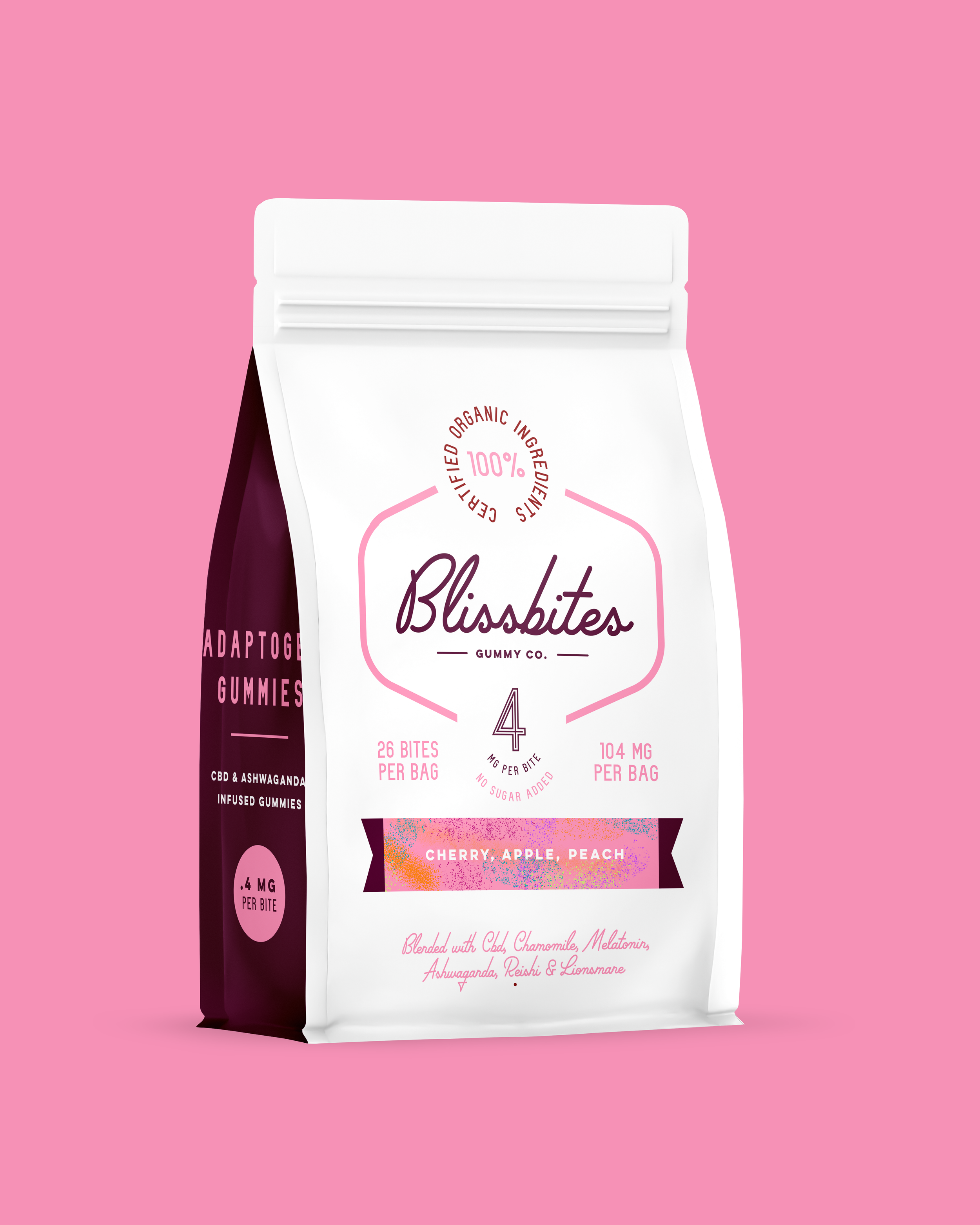
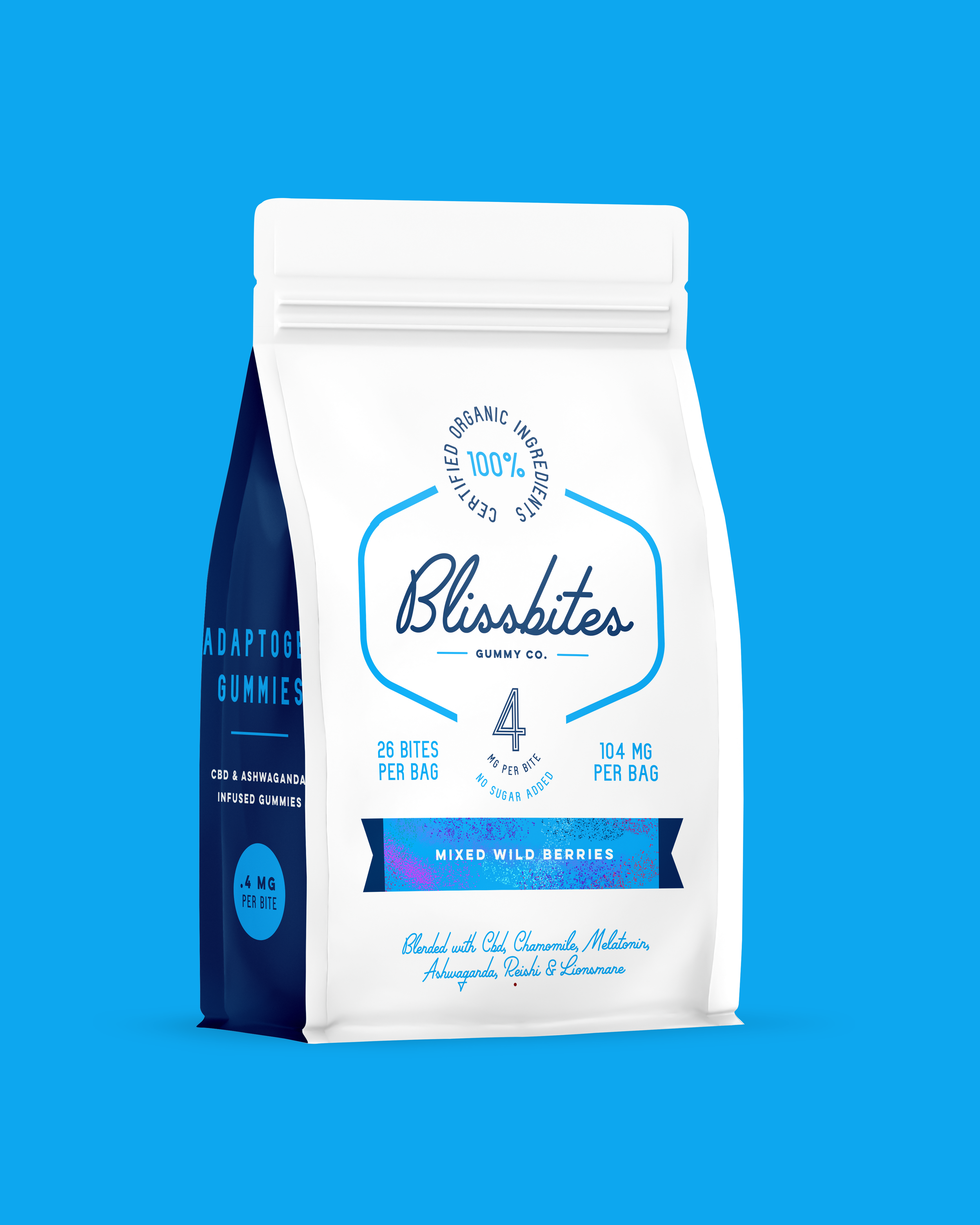
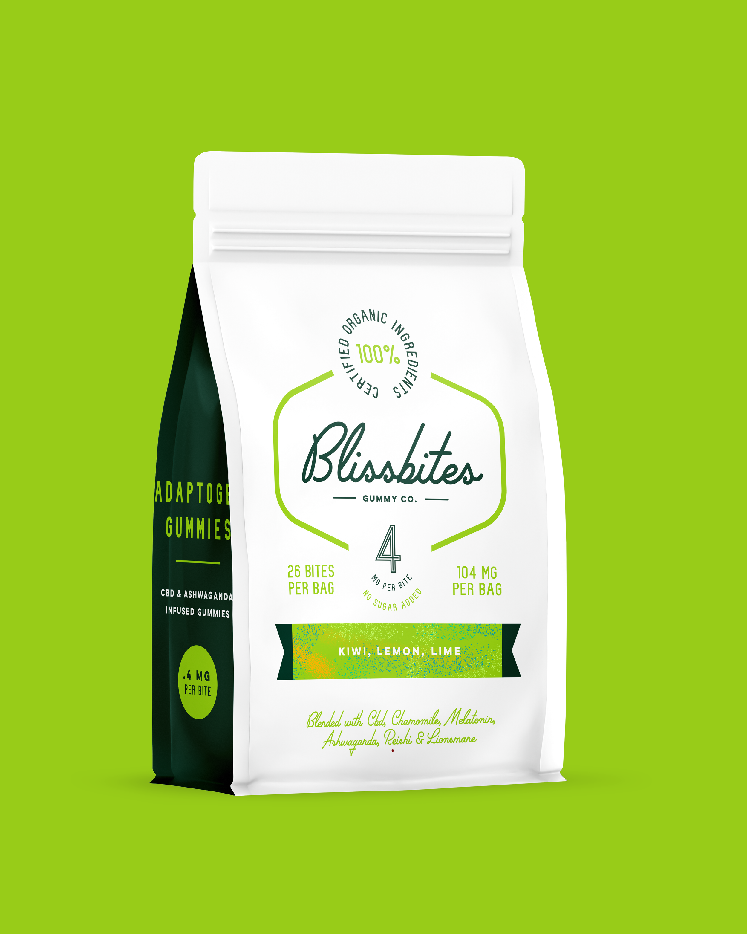
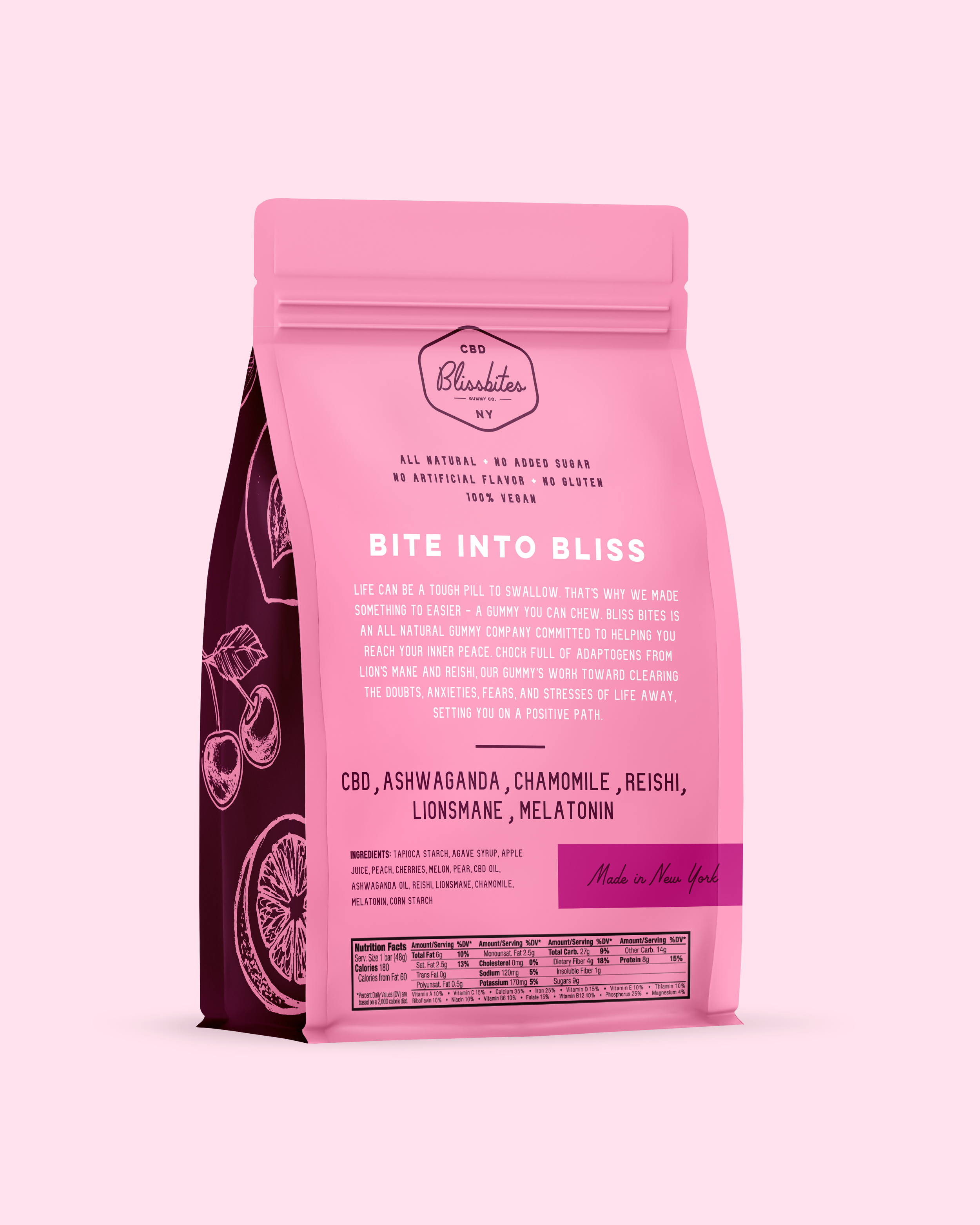


Blissbites is conceptual brand of Adaptogen and CBD gummies with the goal of enlightening its users. Inspiration for this product came from the grueling winters of New York when life was just unapologetically difficult. The idea came from wanting an escape.
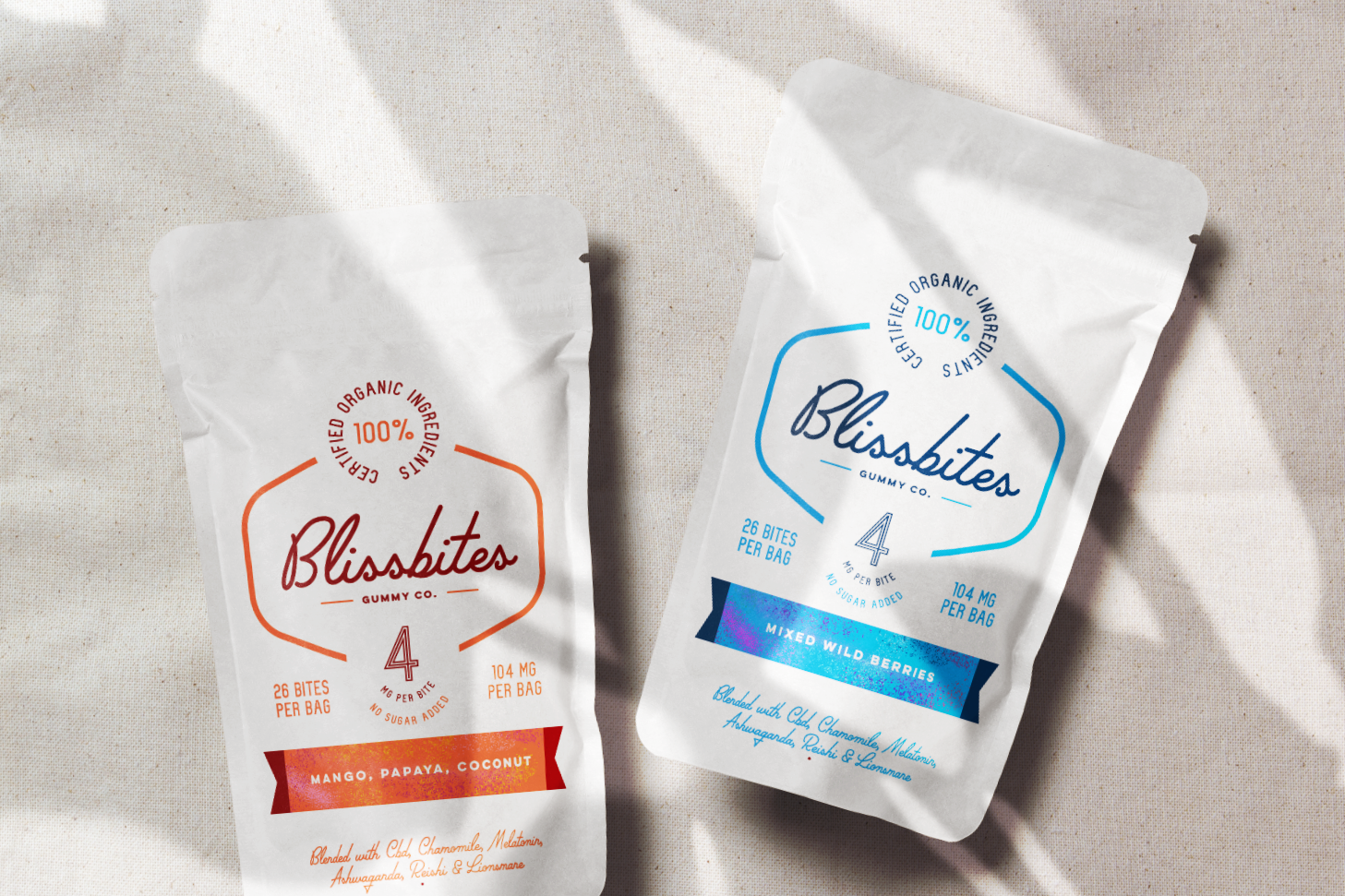
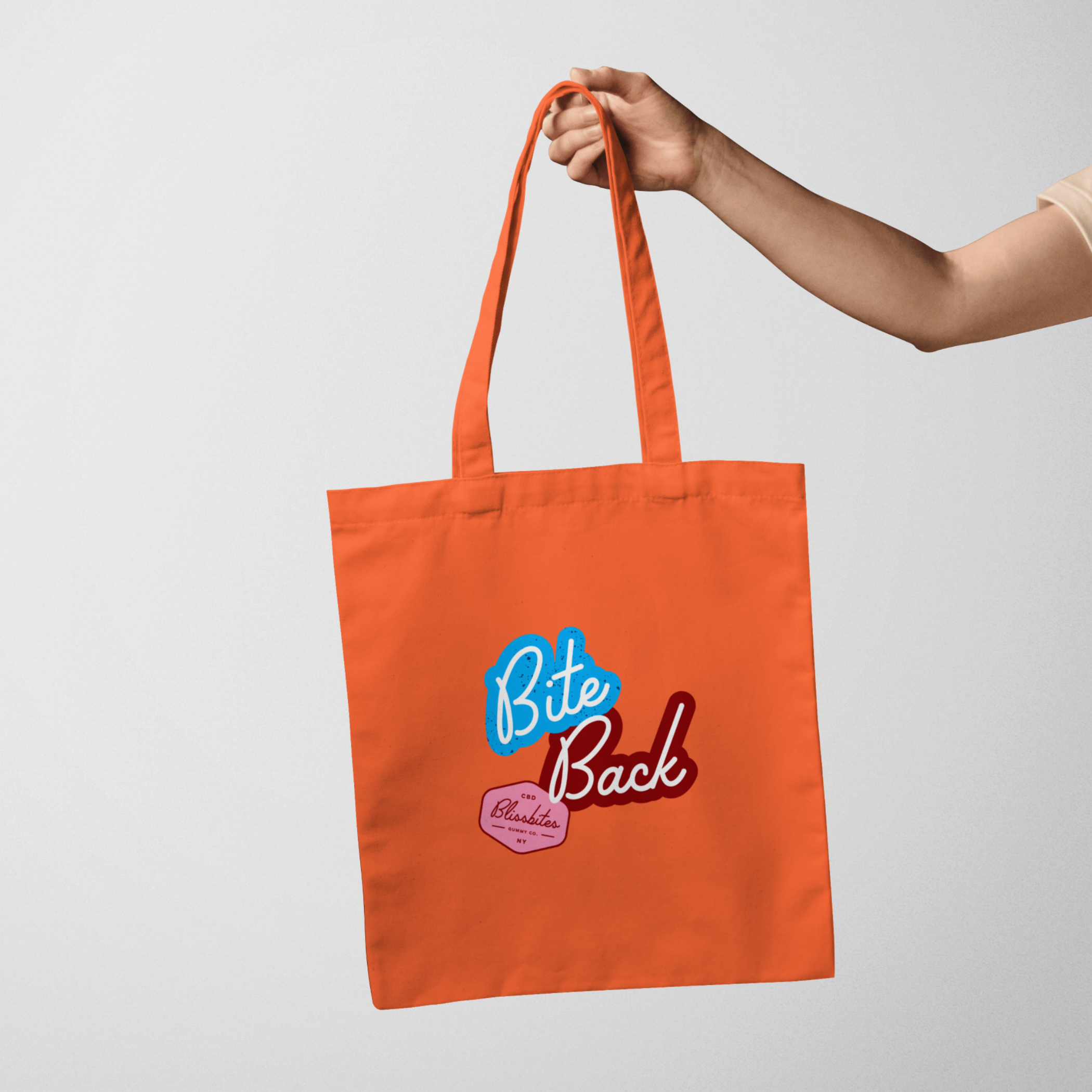
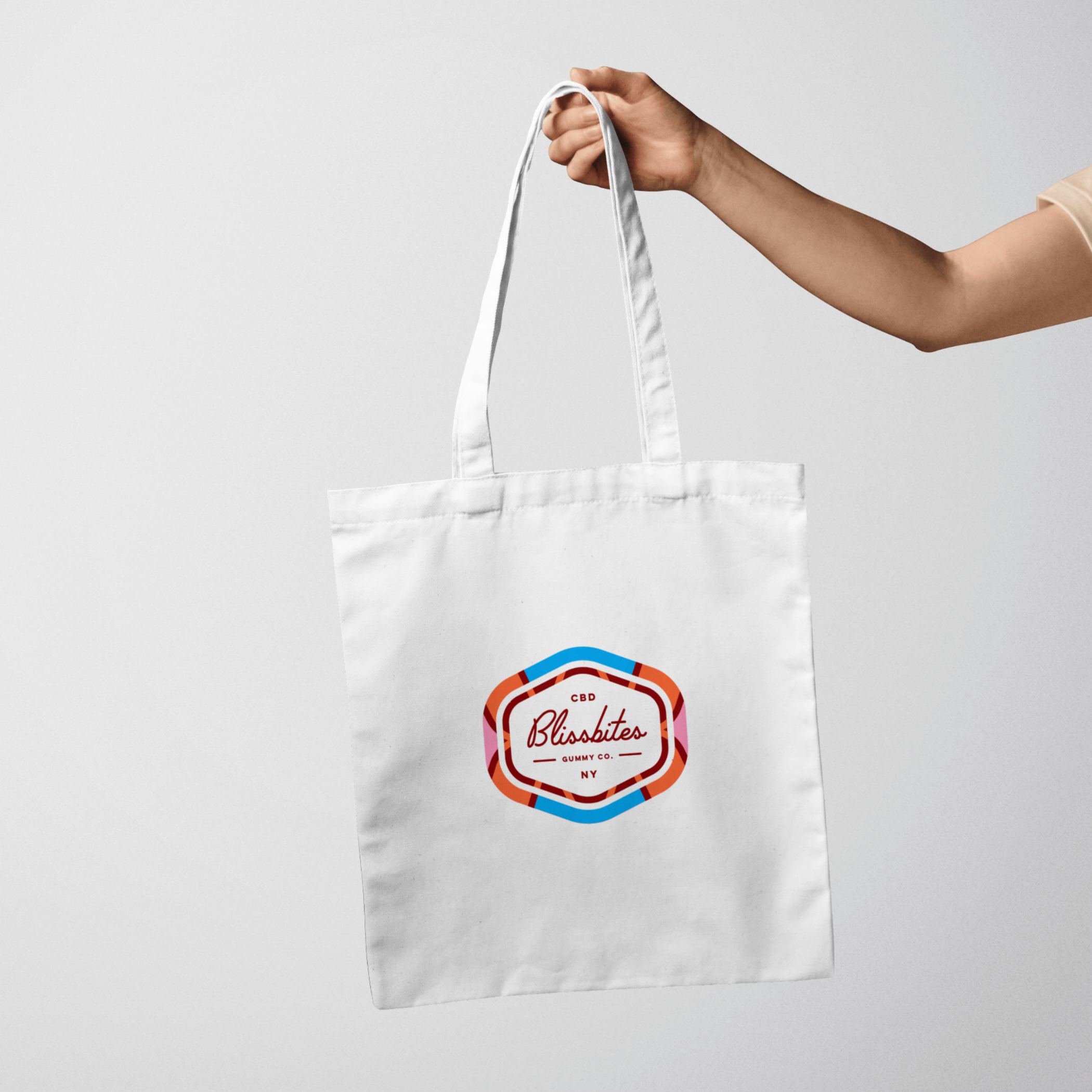
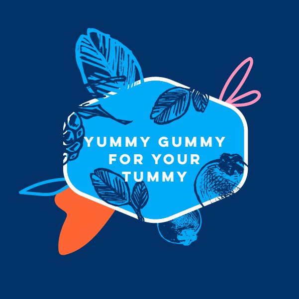
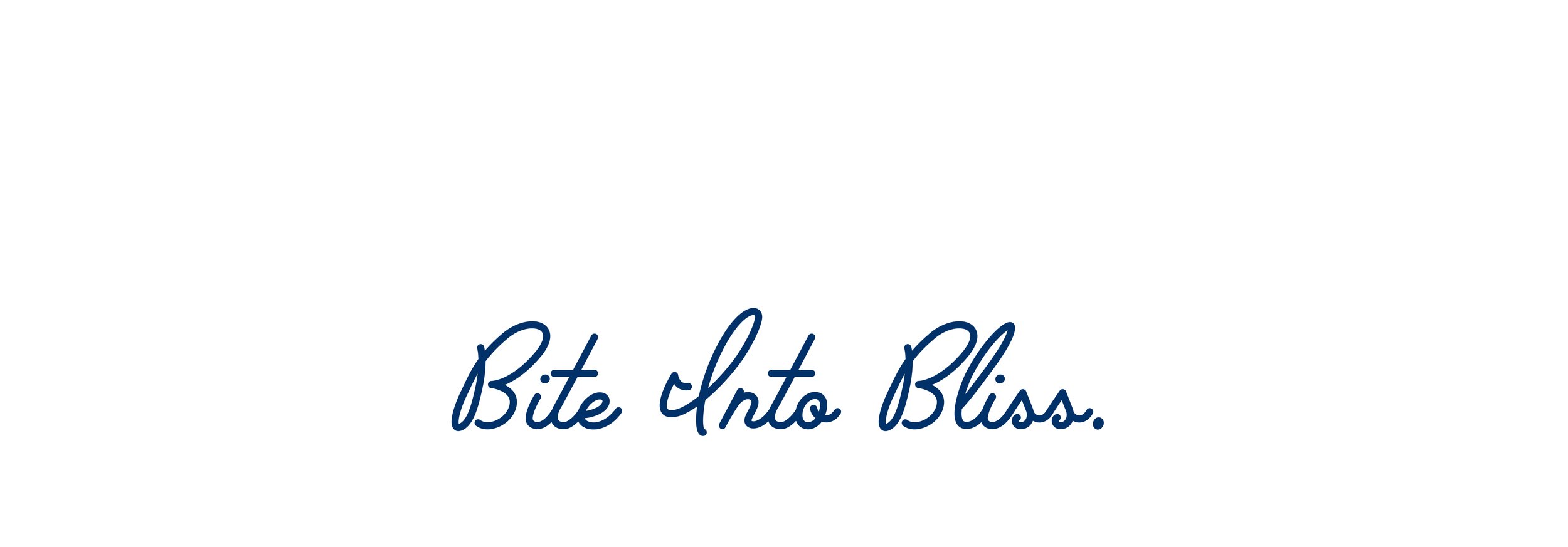
Flat colors, clean lines, and modern fonts are chosen to present a brand that is focused on the well-being of its consumers. The logotype is done in a friendly yet sophisticated cursive typeface.
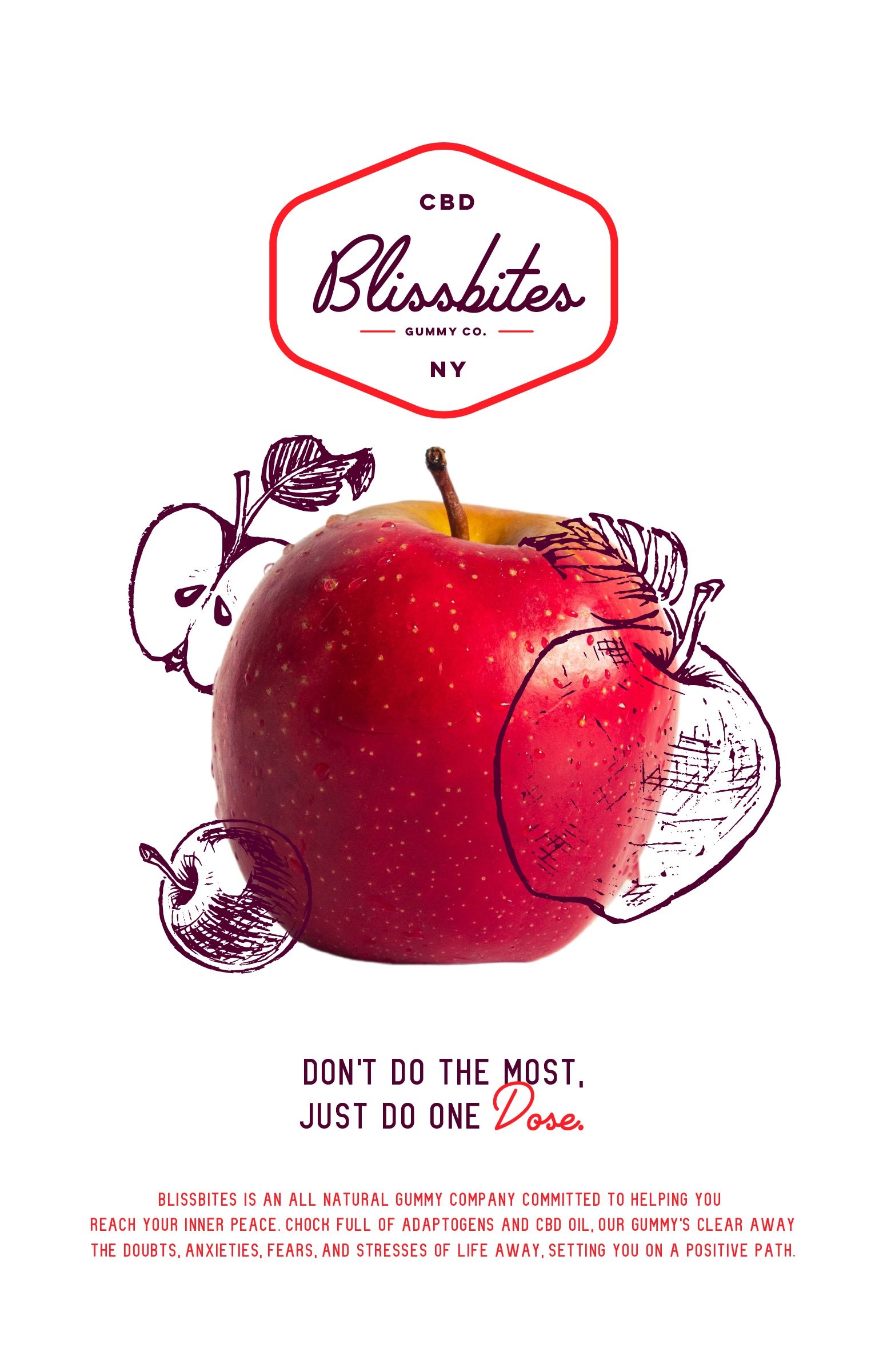
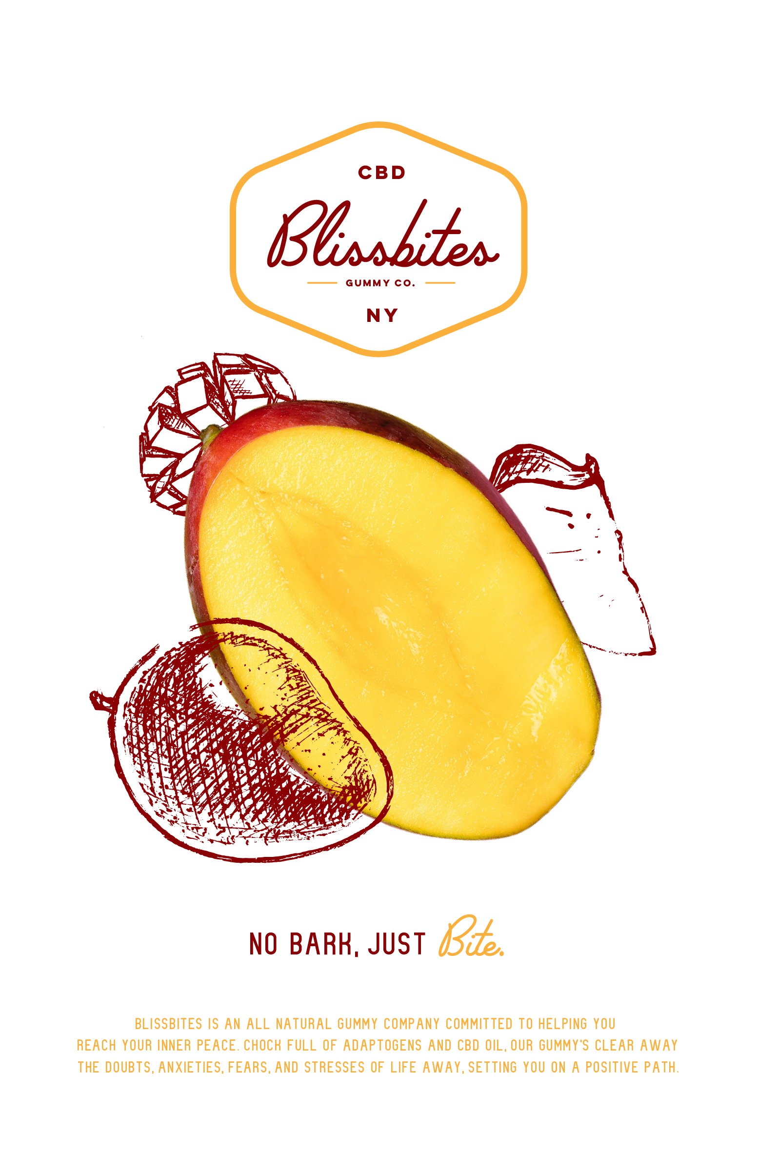
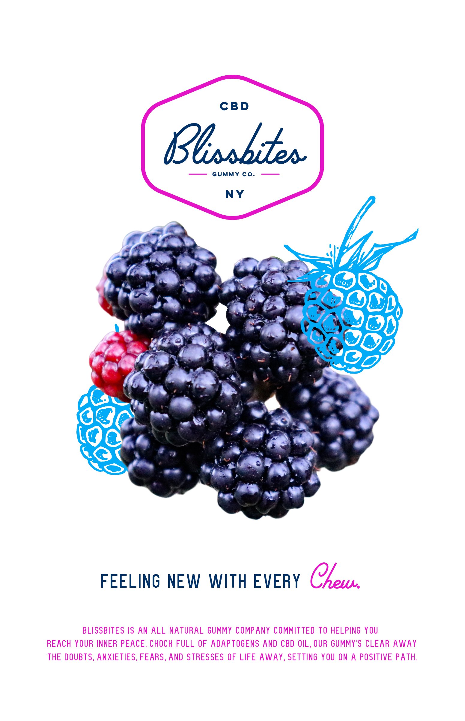
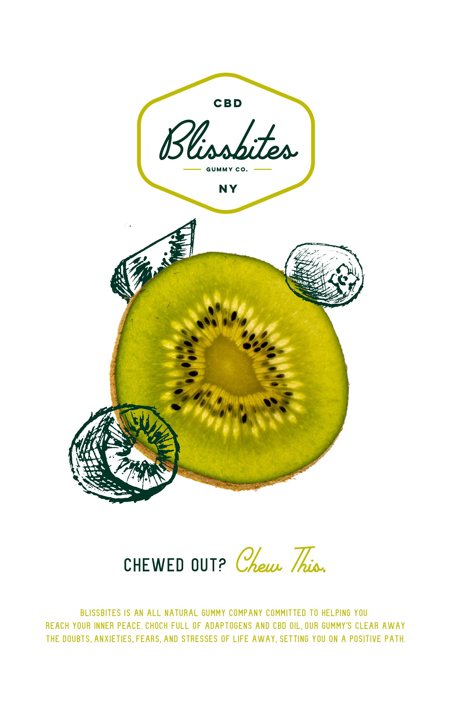
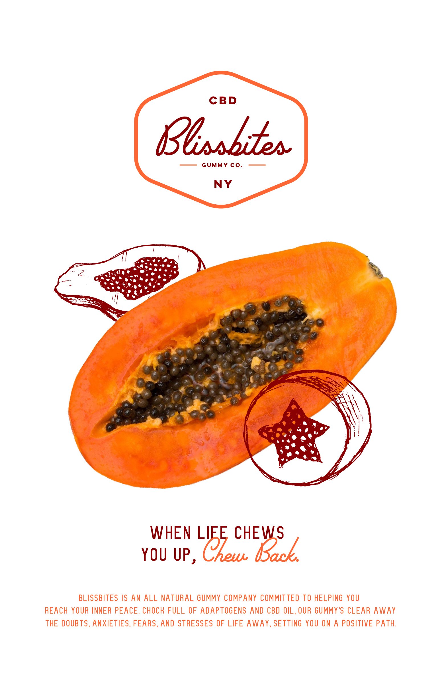
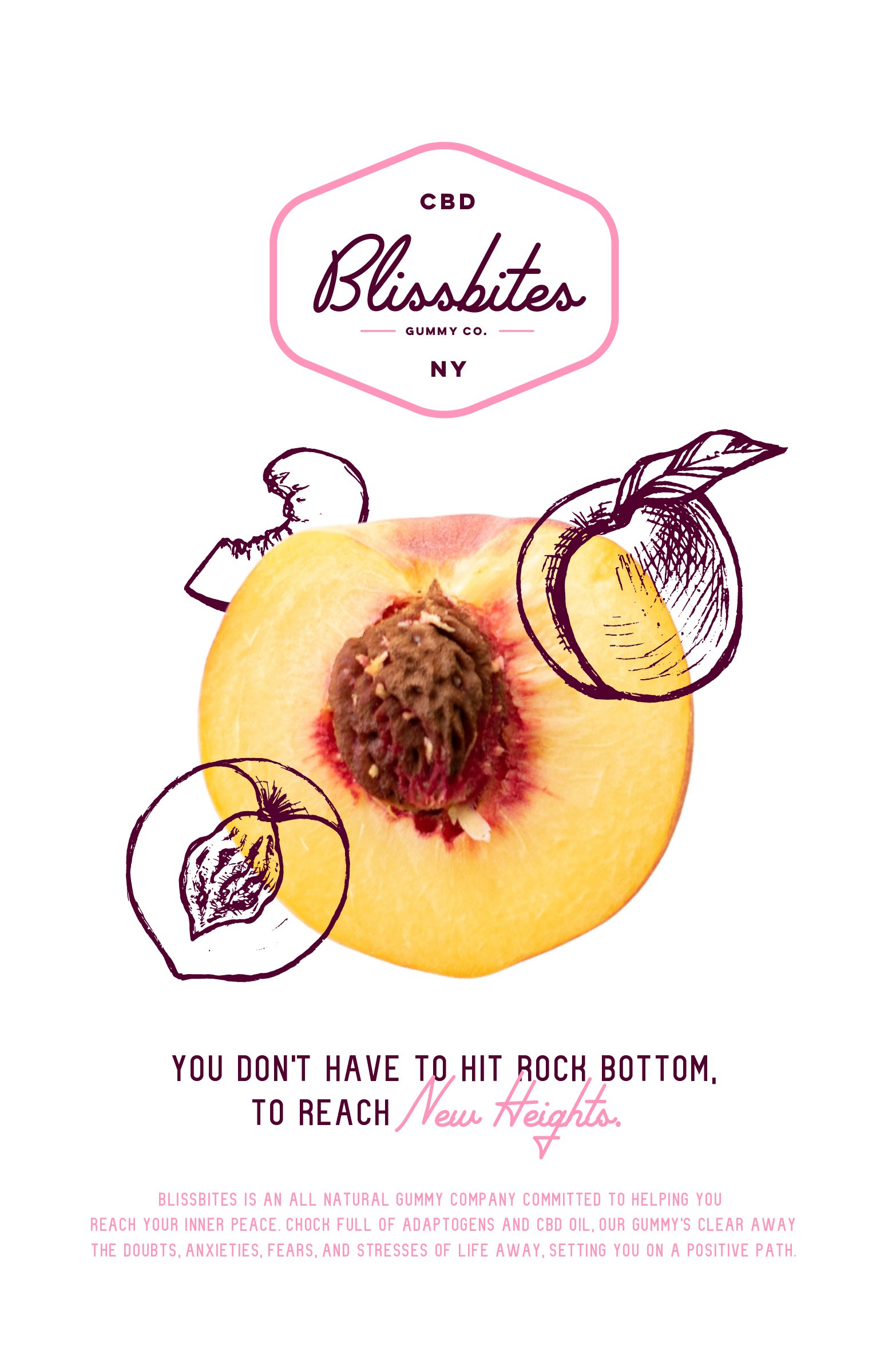
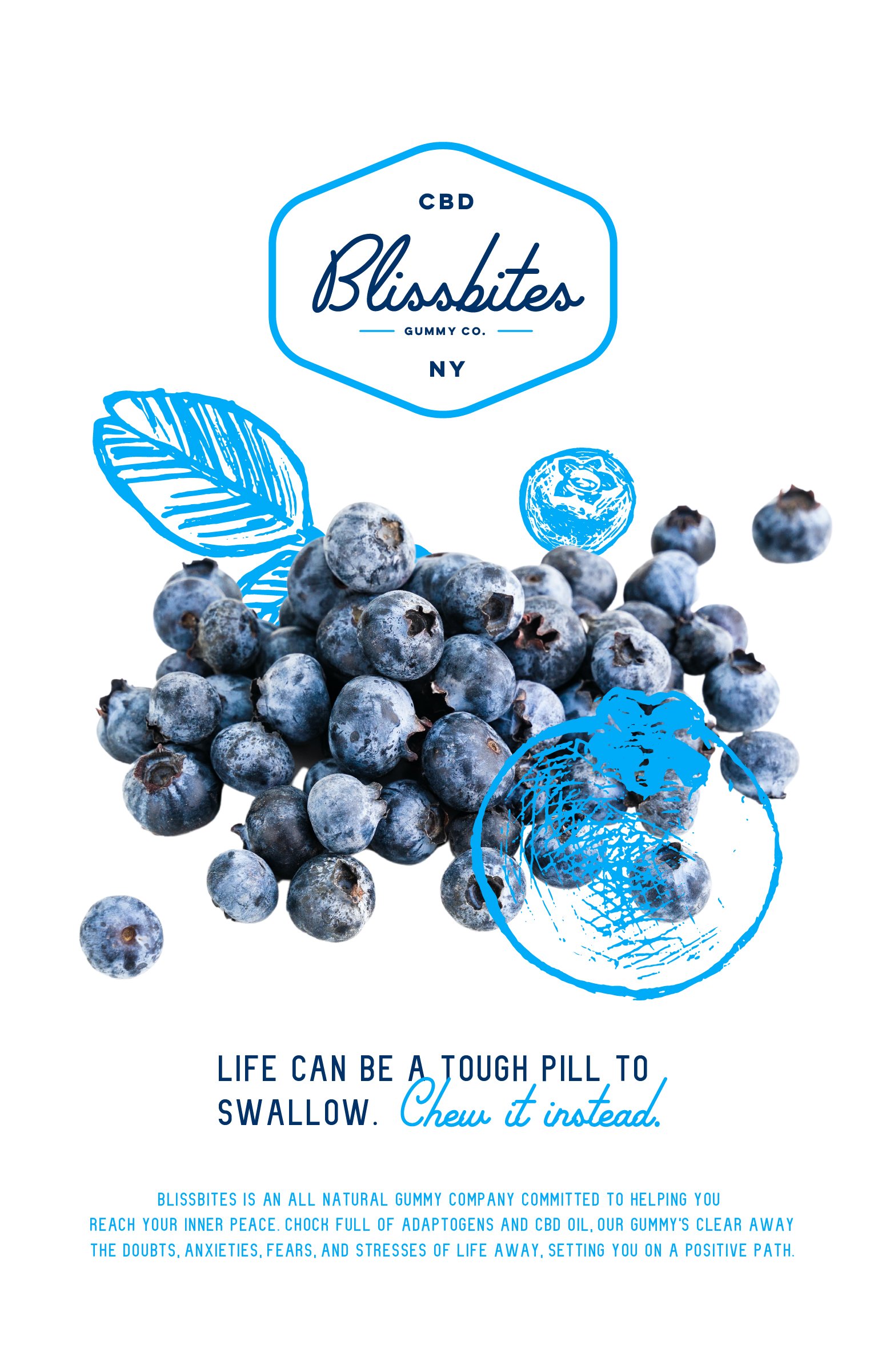
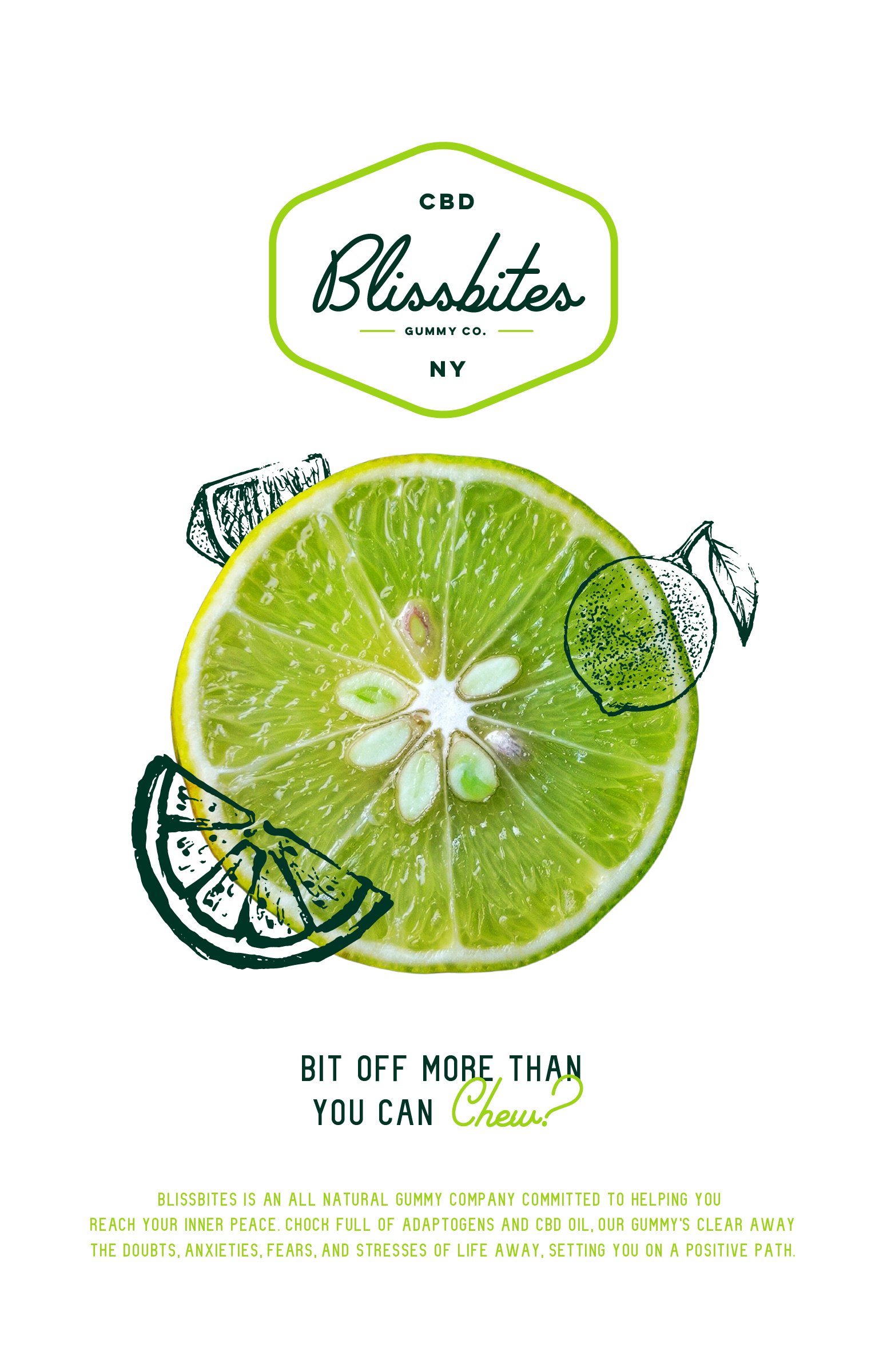
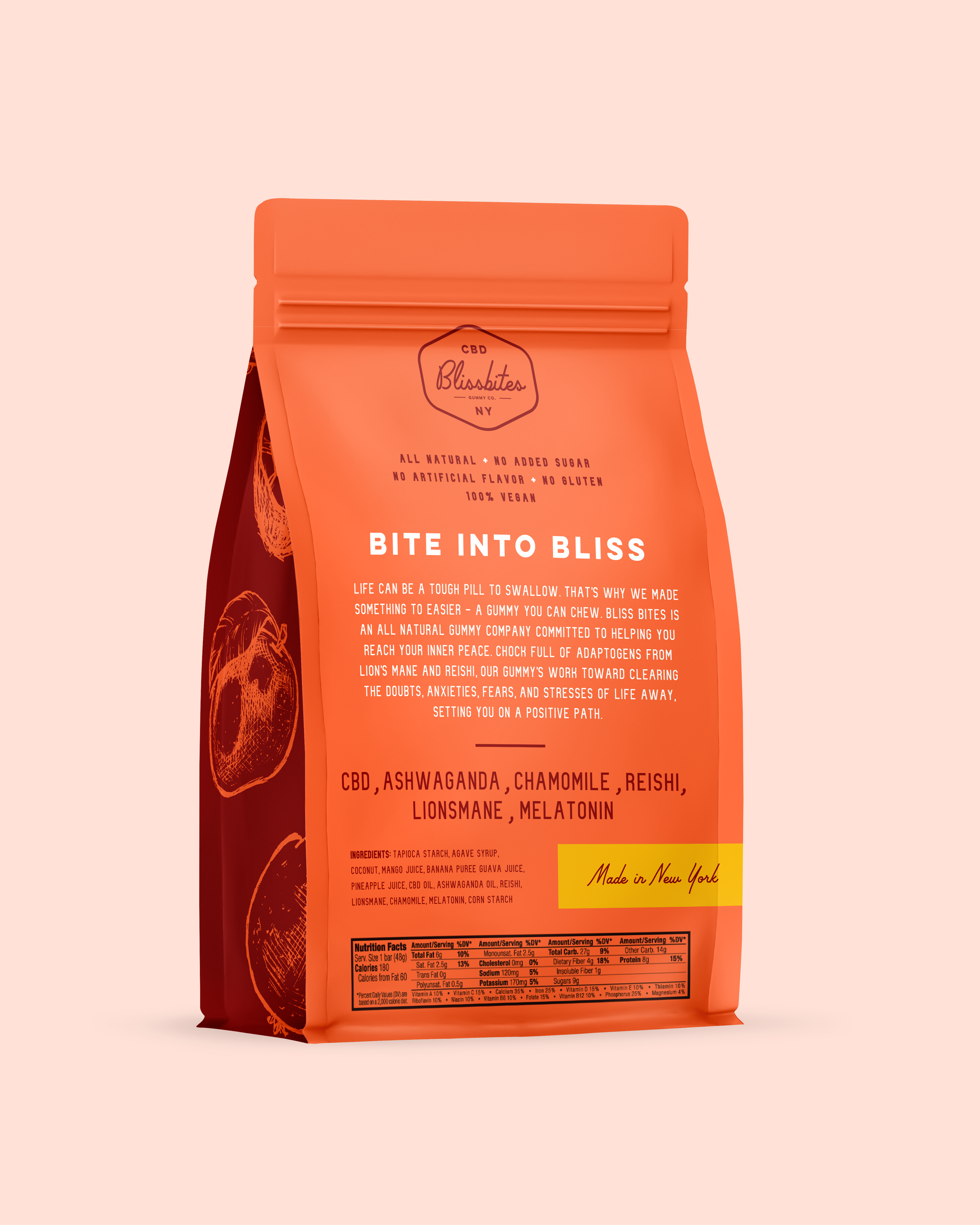
The visual direction was to maintain simplicity and transparency. No bs. With the print ads below, stock images of fruit were paired with illustrations to contrast the style. This in turn references the mission of Blissbites; making something not so special into a vibe. Another example of this is the type pairing; mixing the sans serif with the cursive adds an element of excitement throughout the brand.