East Meets West : Sapporo Rebranding
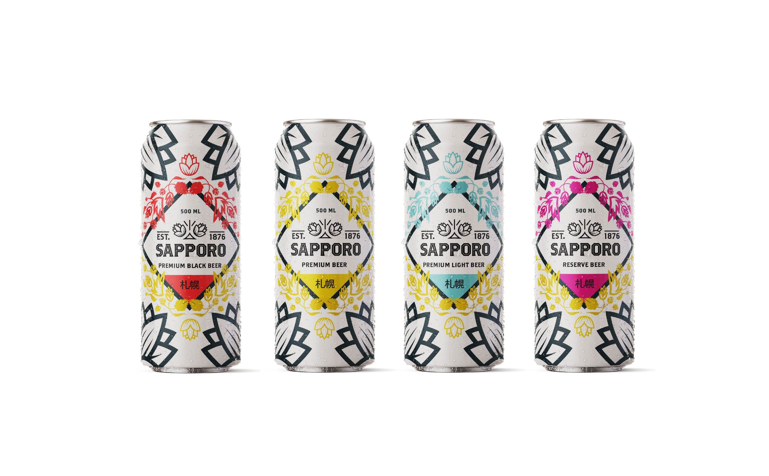
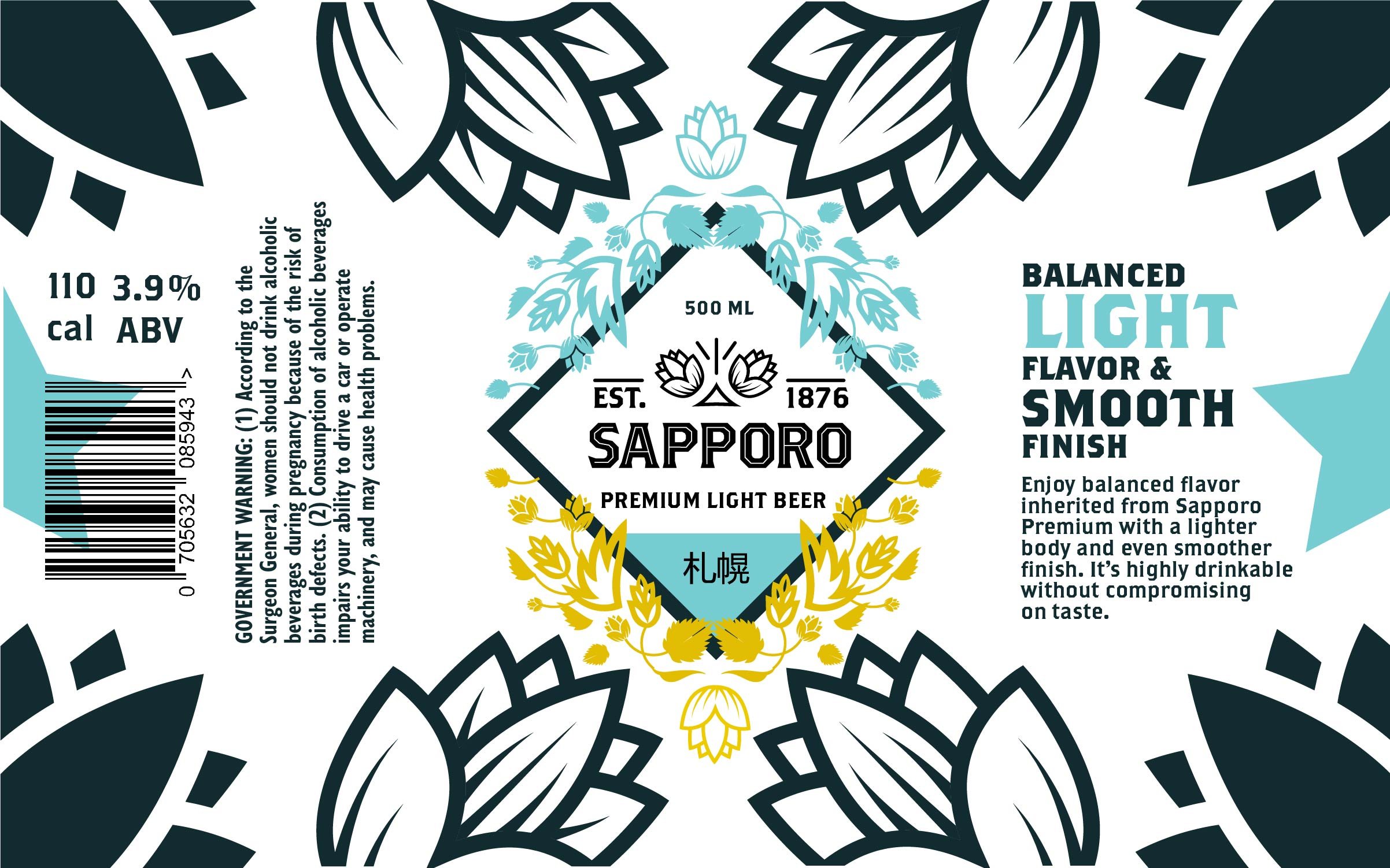
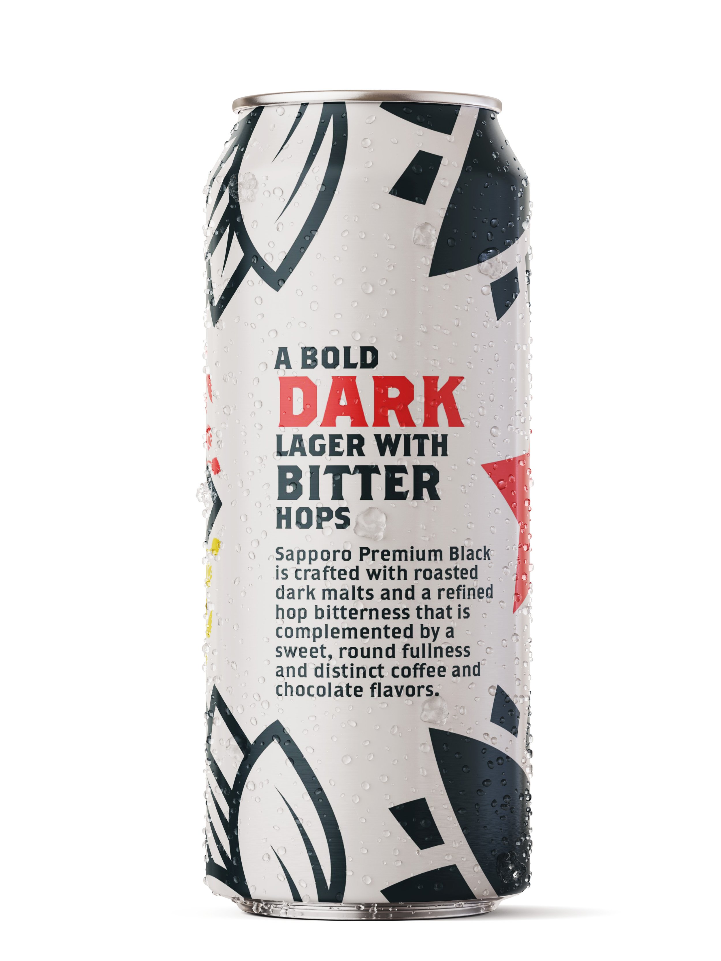
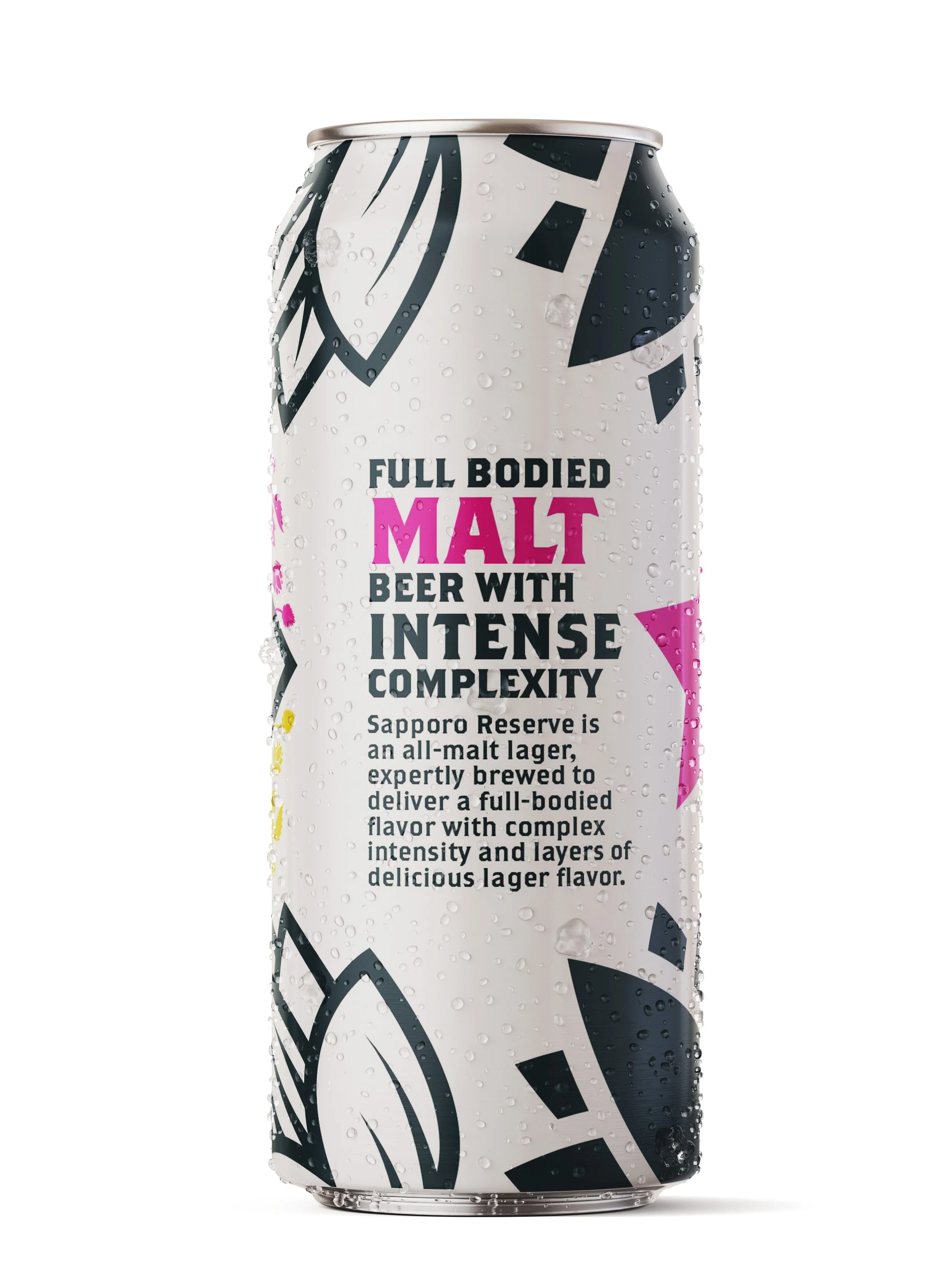
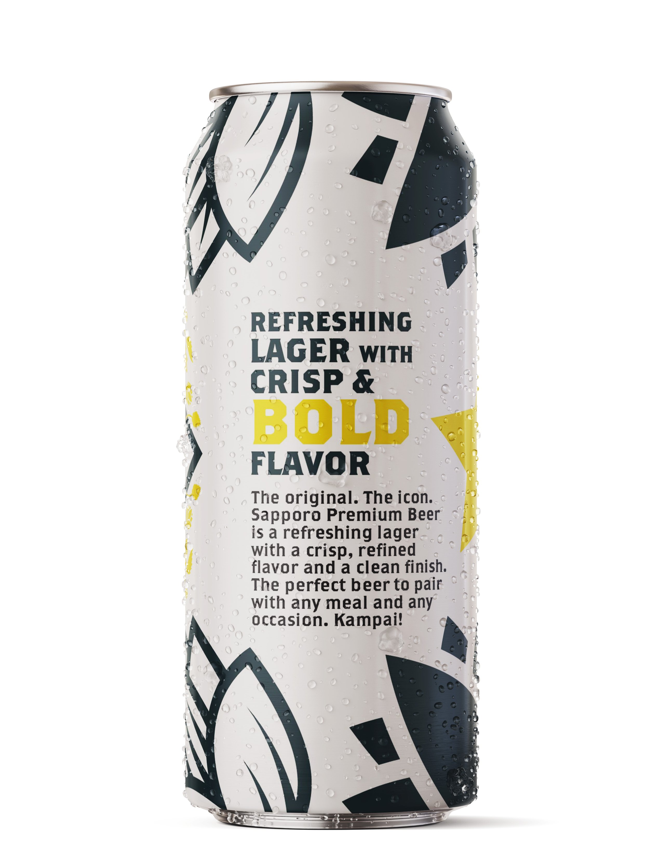
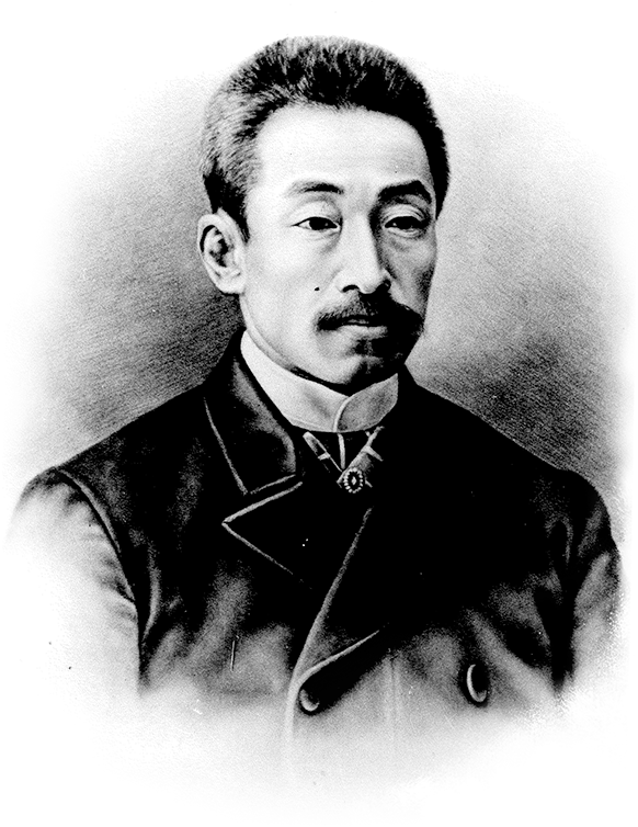
The design of the packaging was inspired by the Sapporo story; Sebei Nakagawa traveled to Germany from Japan in 1876 at age 17 to become Japan’s first brew master. It is a triumphant East meets West journey.
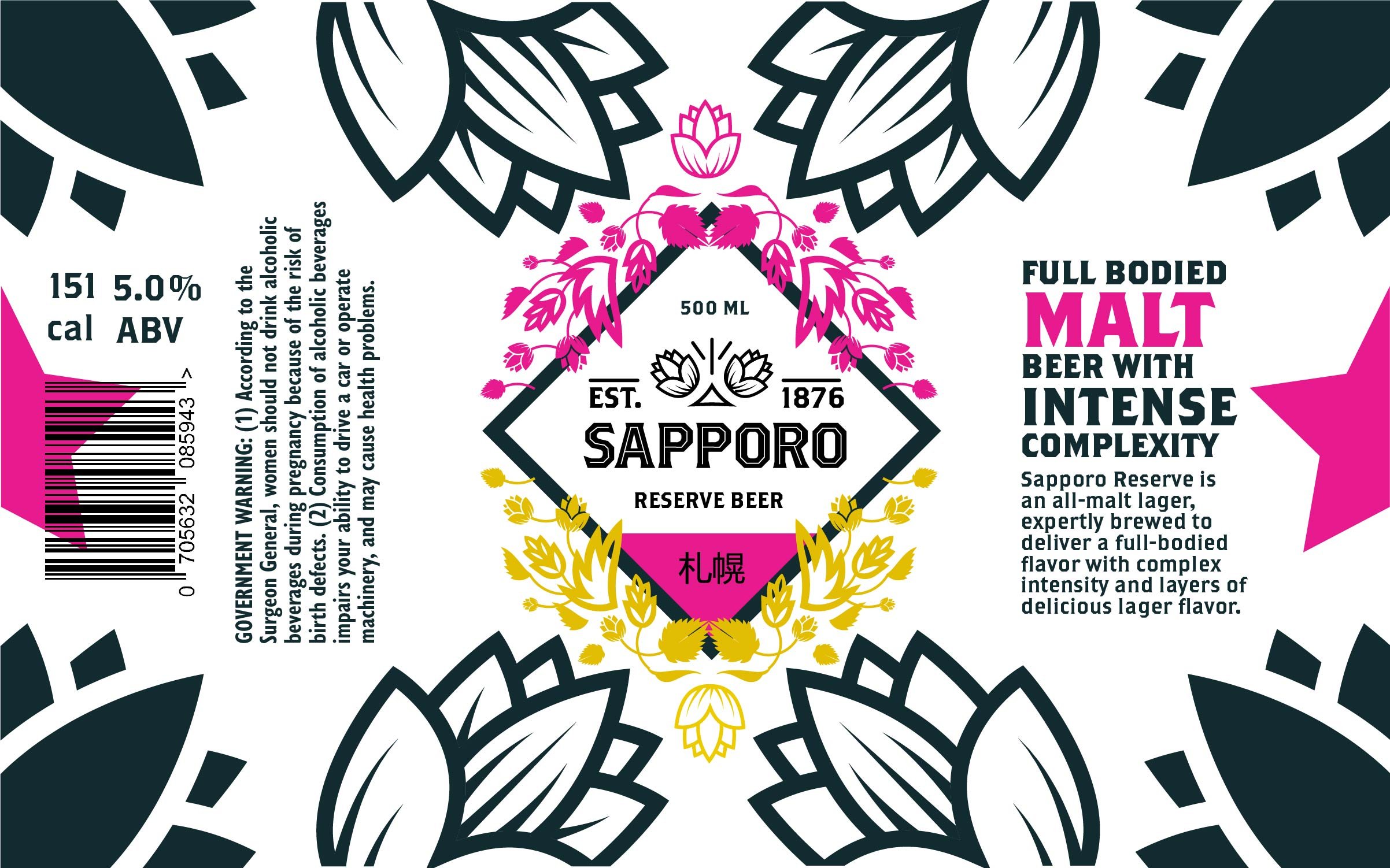
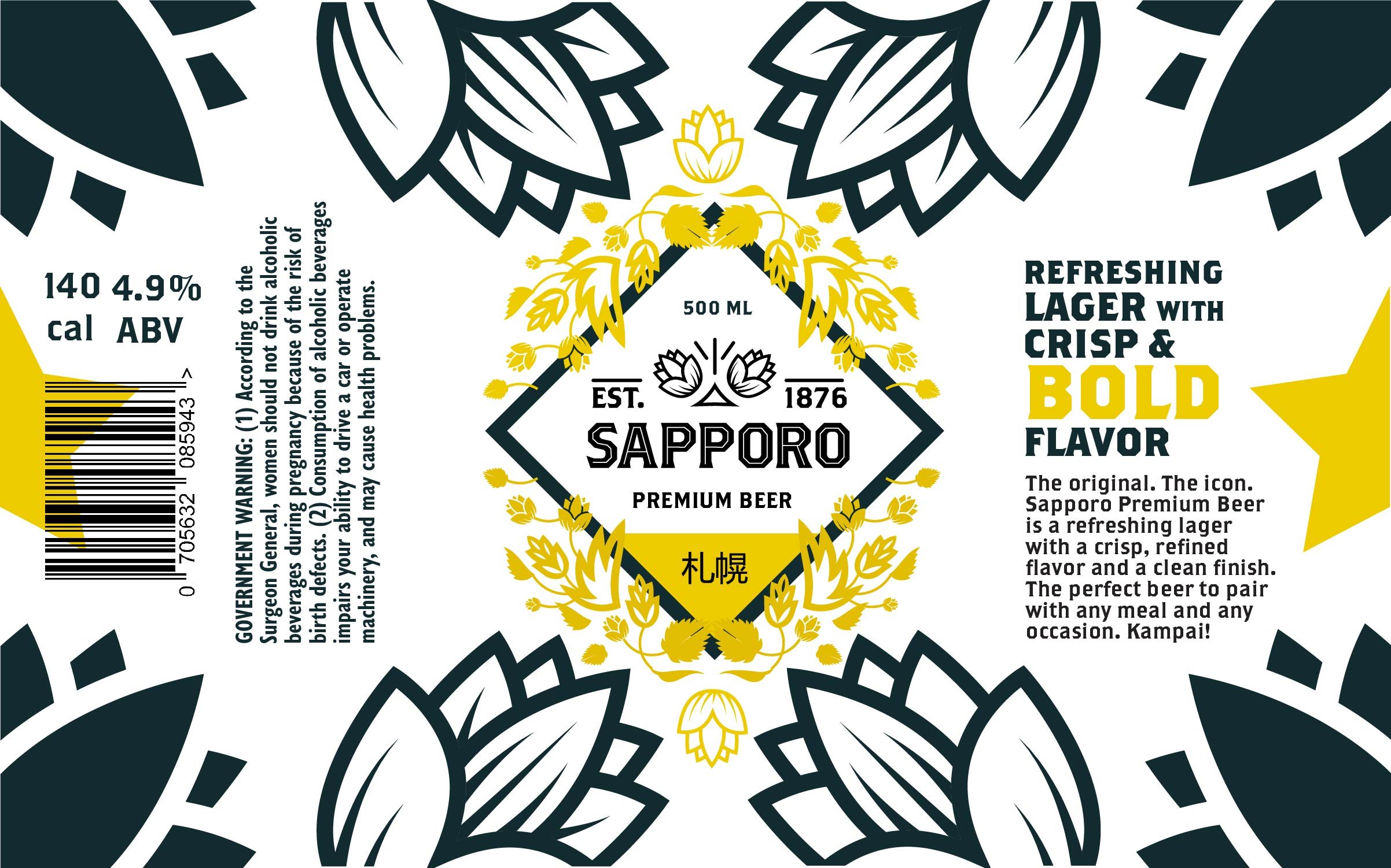
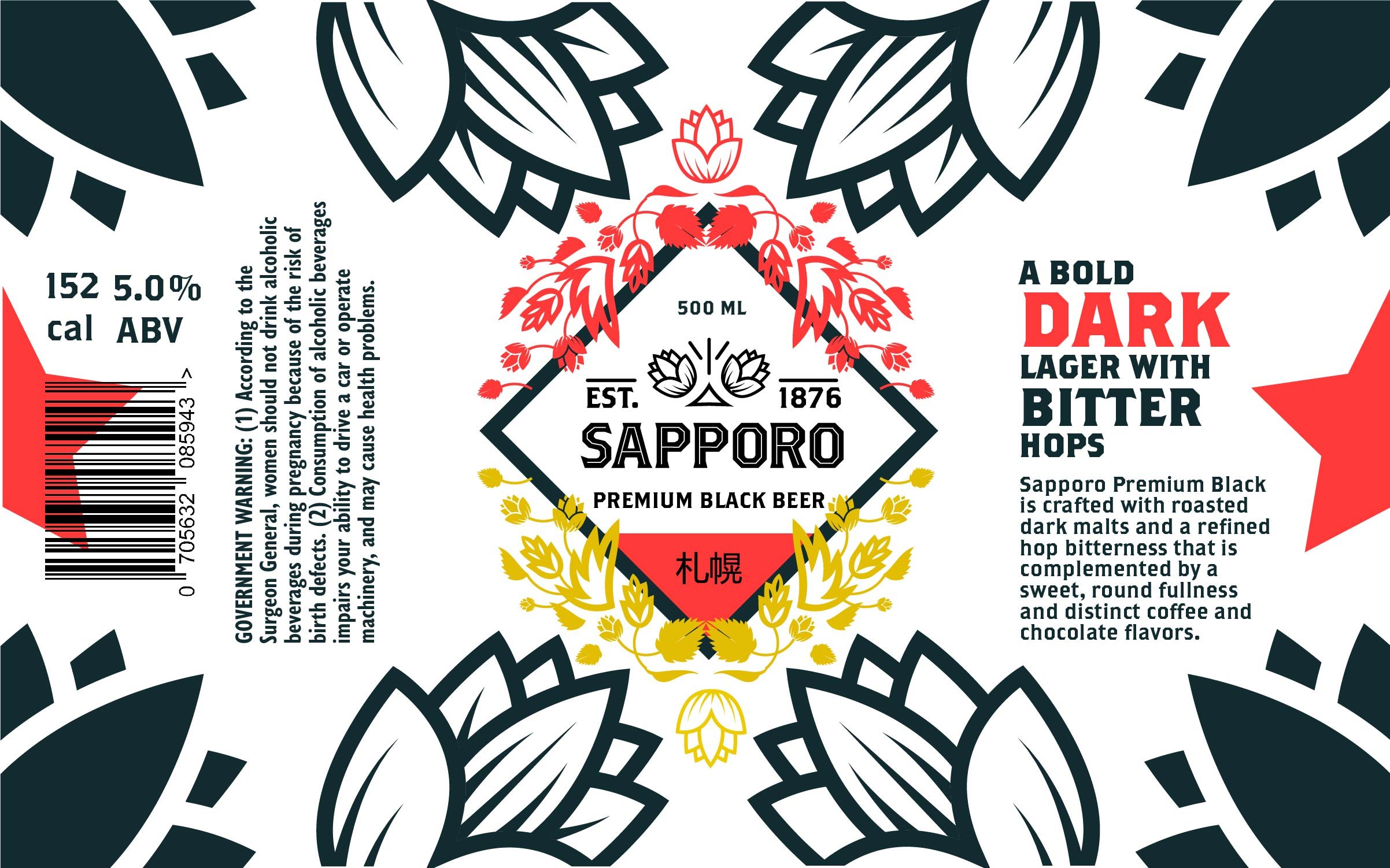
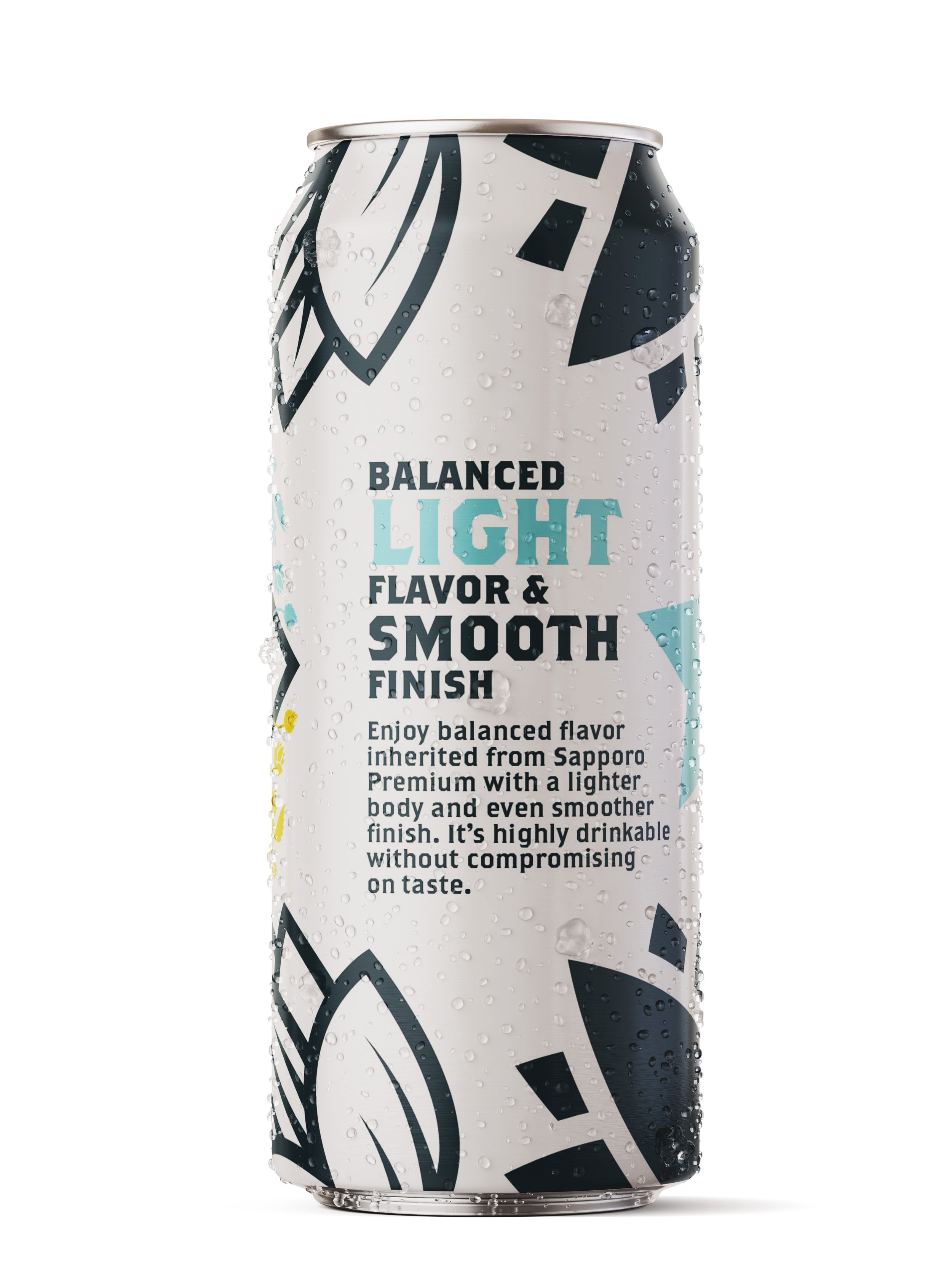
The concept behind redesigning Sapporo beer is about two sides coming together. Each label is given two spot colors to represent what would have been the East (Japan) and the West (Germany) in the creation of the beer. The existing packaging for Sapporo doesn’t tell their story– all it shows is the golden star which they adopted as their logo. For the redesign, the star was used on either edge of the label and when wrapped around the can, the two ends would meet to form the whole star. This is inspired by Sebei’s journey to Germany where he learned the tricks of the trade of brewing, and brought two worlds together. The graphic elements also represent this history. The hops shown on the can are both made as outlines and as solid shapes, inspired by the two sides of the Sapporo story. The colors were inspired by the flavor profile of the beer itself. Light Sapporo is given a light sky blue, the regular premium beer is done in golden yellow which their existing trademark color, malt beer is done in hot pink because of its intense flavor, and the reserve beer is done in red because it is synonymous with the “dark side”. The treatment of the type for the flavor profiles are inspired by the many cultural differences bewteen the east and the west, but how they were able to work together, like the whole is greater than the sum of it’s parts.
