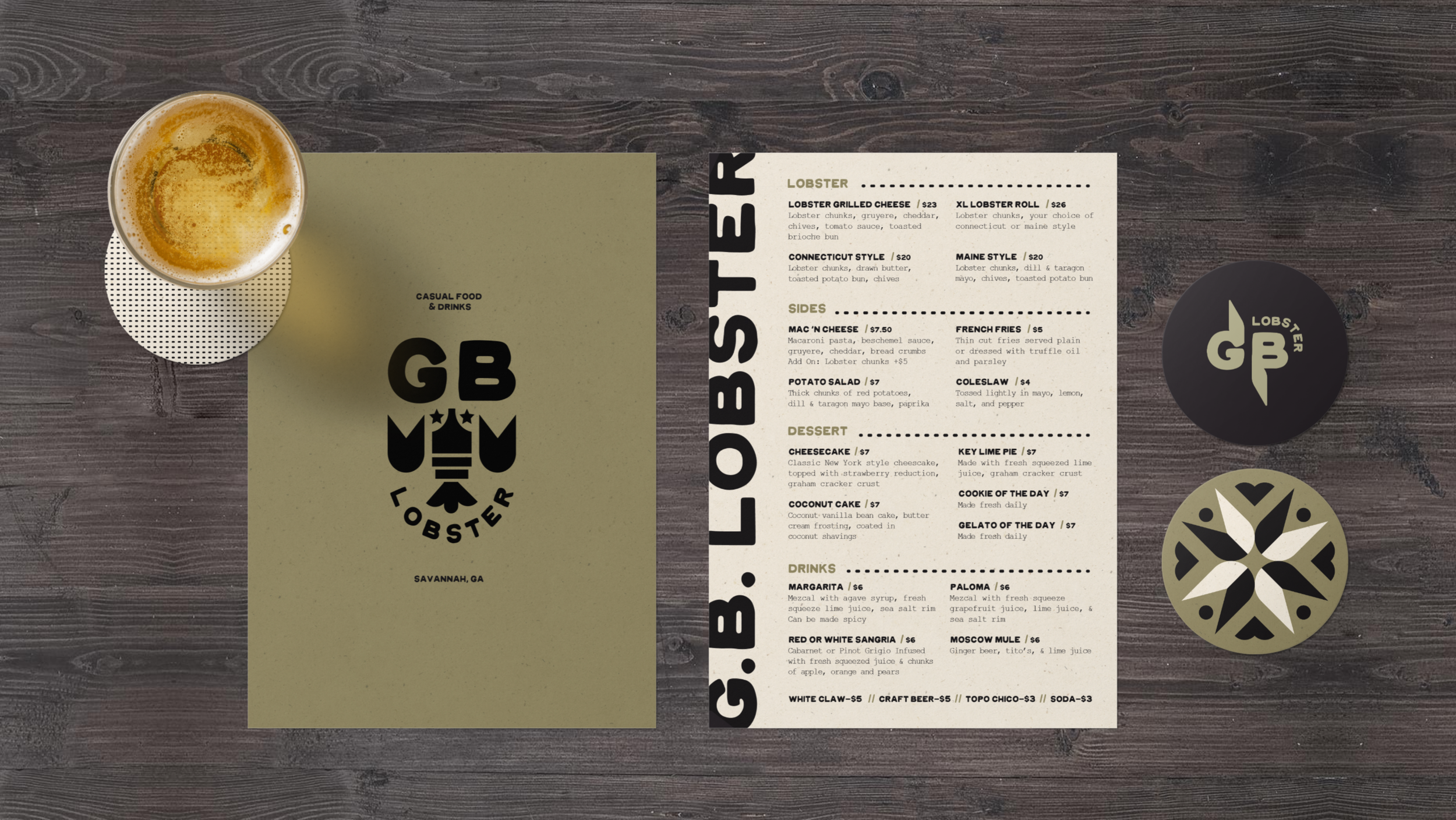
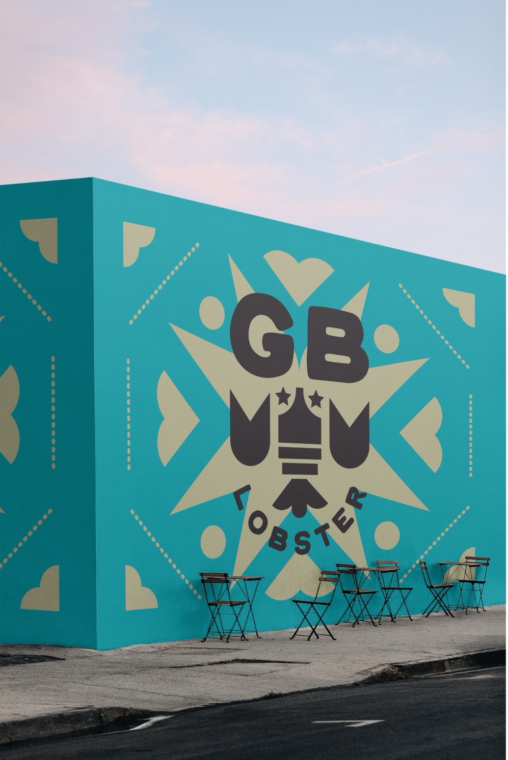
GB LOBSTER REBRANDING
GB Lobster is a quick, affordable and welcoming food stop that was originally based in Savannah, GA. Their first logo featured the owner’s beloved dog, Ghost Buster who was a fixture of the store. Upon speaking to GB Lobster about what they visualized for the new branding, I knew I wanted to steer clear of anything red. So, the goal for GB was to take inspiration from the sea, not just in the color choice but in the choice of materials. The type and color choices are playful, inspired by the restaurant’s authentic friendly spirit. A pattern system inspired by the geometric shapes in a lobster were created to further establish the brand.

It Needs More Lobster!
GB Lobster’s original logo featured the owner’s dog, Ghostbuster, hence the name “GB”. I felt this didn’t relate to the restaurant and it needed to be re-thought. So, naturally I thought, “this logo needs a lobster”. I created a few logo iterations for flexibility in their branding; the Primary lockup includes the name of the restaurant, the restaurant’s slogan and the lobster. The secondary logo mark are the initials “GB” treated with lobster claws. The third mark is the lobster graphic alone.